
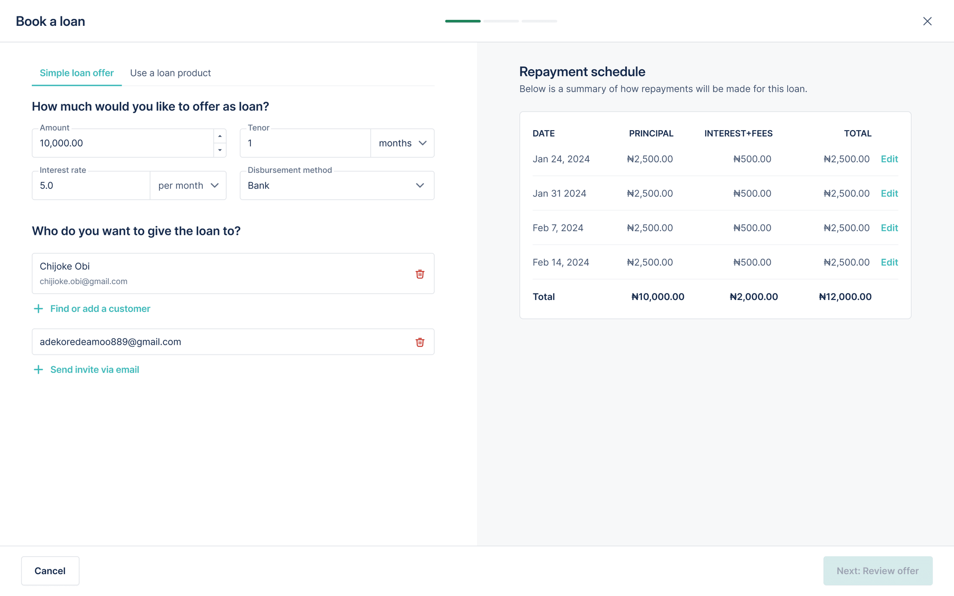
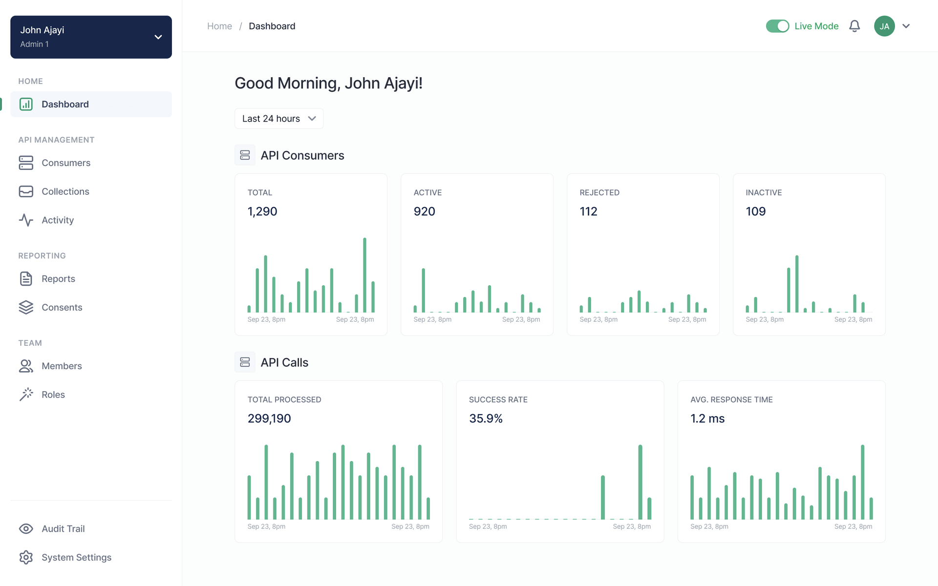
Helping lenders get started faster on Lendsqr’s Admin Console
Lendsqr’s admin console is the back office lenders use to set up and run their lending operations. I redesigned the experience for new lenders, from sign-up and onboarding through Getting Started, while laying the foundations for Pecunia, the back office’s design system.
- Company
- Lendsqr
- Role
- Product Designer
- Type
- Fintech, Lending, UX Design, Design Systems, Onboarding Optimisation
- Impact
- 60% fewer misaligned sign-ups
- Onboarding down from over 10 minutes to 3–5
- Seven onboarding steps cut to three
- Pecunia design system adopted beyond the redesign
Why the back office needed to evolve
Lendsqr had evolved from a lending infrastructure product into a broader platform with more capabilities for lenders. This growth was valuable for the business, but it also created product complexity.
The back office now had to support different types of lenders, multiple setup tasks, new feature areas, and operational workflows. For experienced users, the power of the platform was useful. For new users, however, the first experience could feel overwhelming.
The challenge was not simply to modernise the interface. The deeper opportunity was to help new lenders understand the product faster, reach value earlier, and reduce the amount of hand-holding required from the internal team.
The problem
The wrong users were entering the product
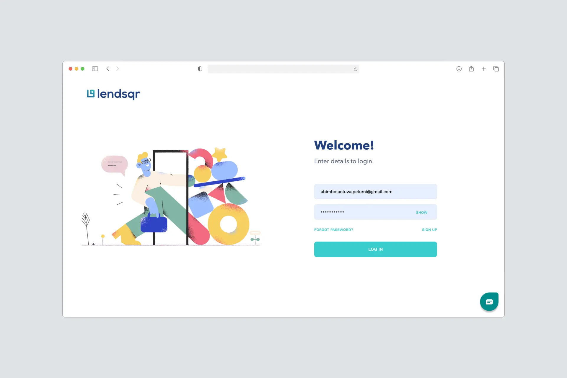
A large portion of sign-up traffic came from borrowers who were looking for loans, not lenders who wanted to use Lendsqr’s infrastructure. About 80% of sign-up traffic was coming from borrowers, even though the back office was built for lenders.
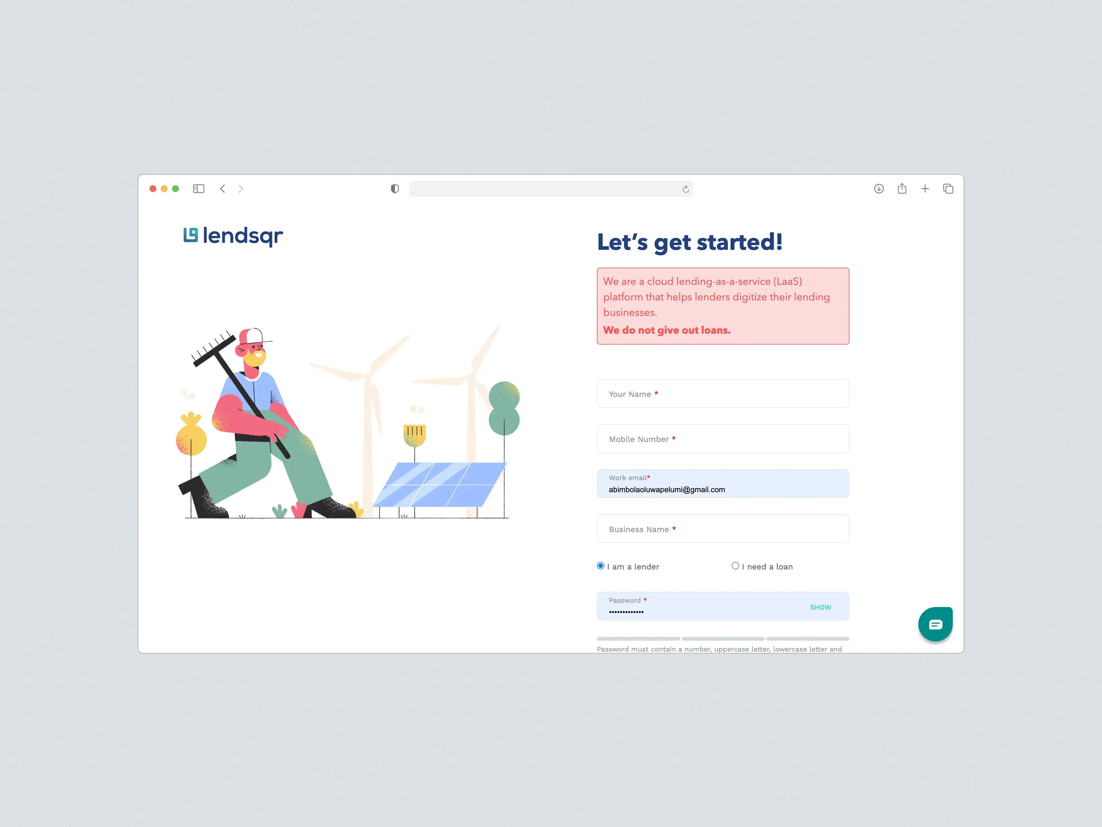
The team had tried to solve this with a disclaimer on the sign-up page stating that Lendsqr did not give out loans. But this did not work well enough. Borrowers still entered the flow, and the warning created a poor first impression.
Lenders were taking too long to get started
The onboarding flow asked users to complete too many steps before they could access the product. Some of these steps were important eventually, but not all of them were necessary before a lender could begin exploring the back office.
This increased time-to-access and made the product feel heavier than it needed to be.
New users did not know what to do after sign-up
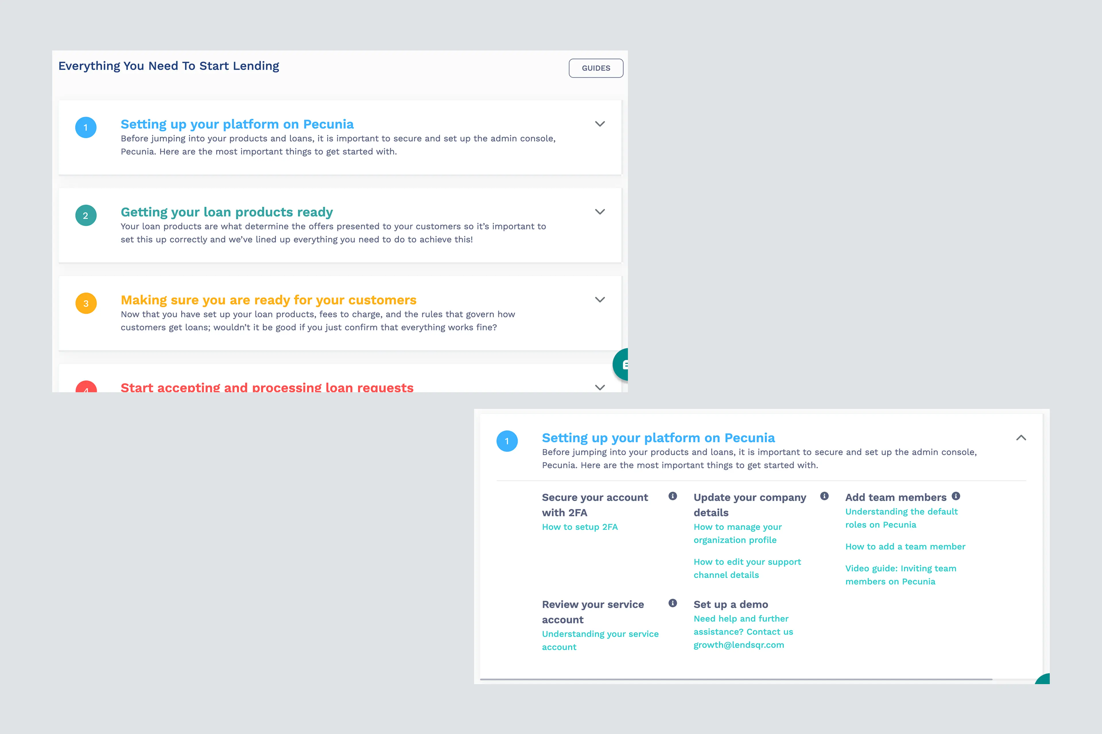
Even after completing onboarding, for a product like this, lenders still needed guidance. The existing Getting Started experience relied heavily on guides and information links. It gave users resources, but not enough direction, leaving them unsure of what action to actually take first and see value early on.
The interface had become inconsistent
As new features were added, UI patterns became less consistent. This made the experience feel fragmented and created extra work for design and engineering whenever new features needed to be shipped.
My role
I led the product design work across the redesign, from problem framing and UX audit to interface design, prototyping, design QA, and design system creation.
I was the sole designer on the project and worked closely with two engineers, a product manager, and the founder, who was actively involved throughout. The work ran to about a month of research and design and two further months of build support and design QA.
My work covered:
- Auditing the existing onboarding and back office experience
- Reviewing findings from an external UX audit
- Identifying gaps in the sign-up, onboarding, and early activation flows
- Redesigning the sign-up journey to segment lenders and borrowers earlier
- Streamlining onboarding by moving non-critical setup tasks into the product
- Redesigning the Getting Started experience to make it more action-oriented
- Introducing default loan products to help users experience value faster
- Creating the foundations for the Pecunia Design System
- Supporting implementation through design QA
- Validating the experience through usability testing before and after the redesign
Goals
The redesign focused on five product and business goals within a tight three-month design and development timeline:
- Help the right users enter the right journey
- Reduce the time it took lenders to complete onboarding
- Help new users understand what to do after sign-up
- Reduce support requests caused by basic onboarding and navigation issues
- Create a more consistent design foundation for future product development
Constraints
The redesign had to happen within a tight delivery timeline, which meant I could not redesign the entire back office at once.
We prioritised the highest-impact parts of the platform, especially onboarding and early setup, because those were the areas creating the most friction for users and the business. This constraint also shaped the decision to introduce a design system: even when a screen was outside the immediate redesign scope, engineers could still use the new component patterns to refactor and improve parts of the product more consistently.
The broader redesign and UX improvements across the rest of the platform continued later, when I joined the company full time.
The solution
Segmenting users before sign-up
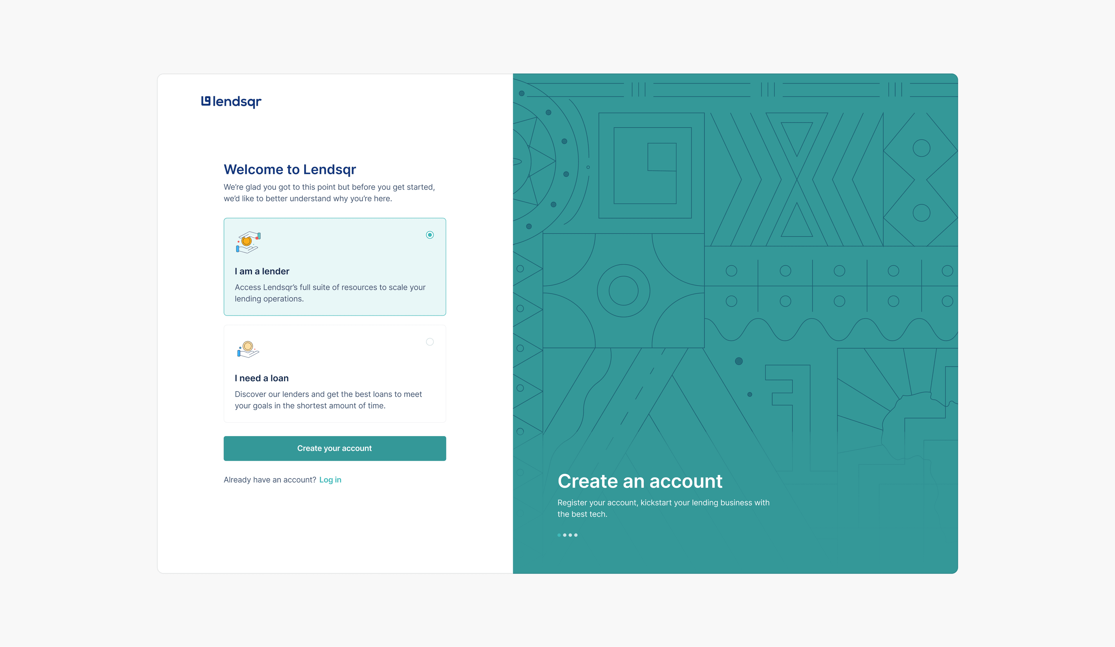
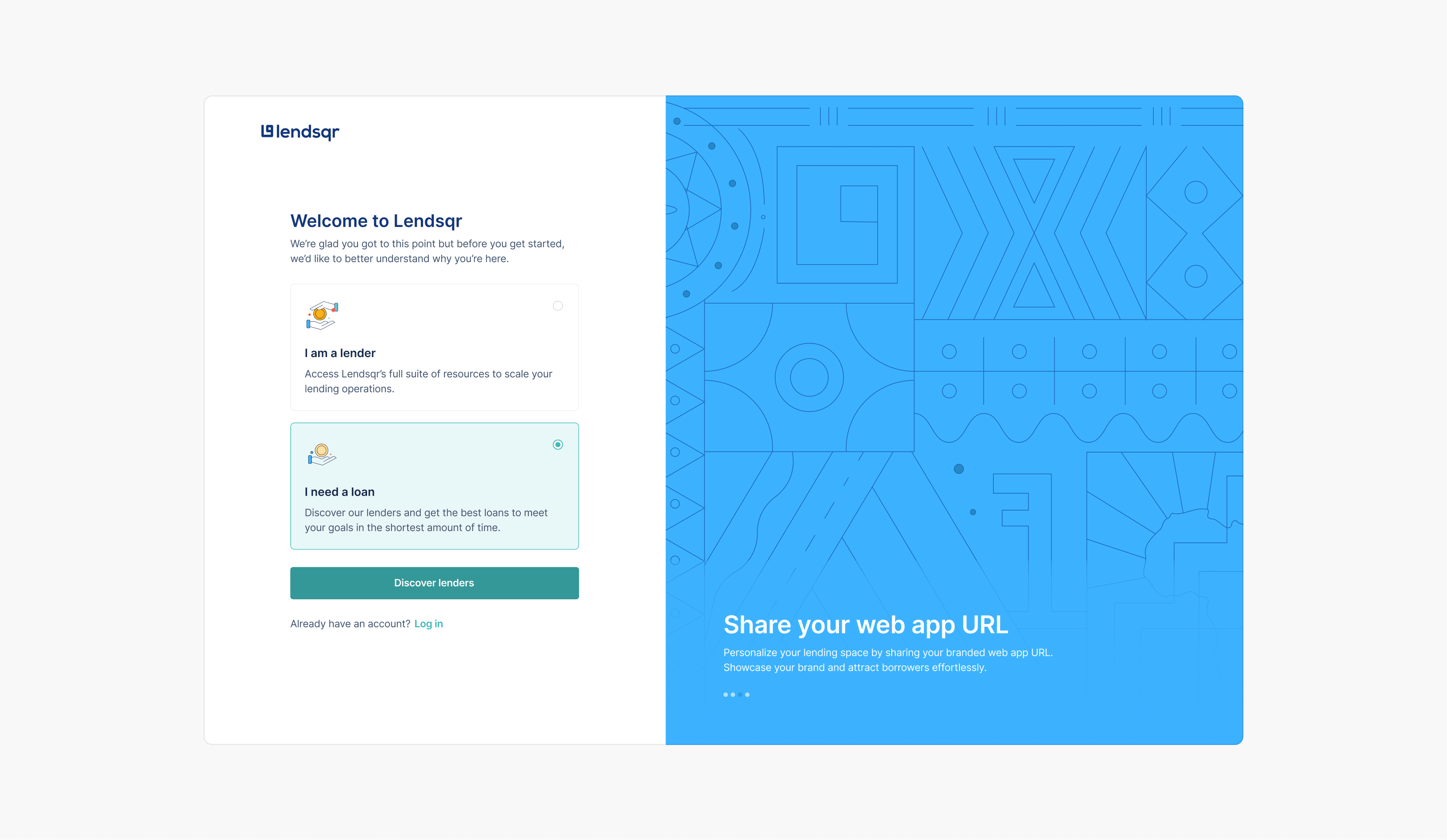
To reduce misaligned sign-ups, I redesigned the start of the onboarding flow to capture user intent before anything else.
Instead of relying on a passive disclaimer, users were now asked to choose whether they were a lender trying to use Lendsqr or a borrower looking for a loan. Lenders continued into the back office onboarding flow, while borrowers were directed to the lender directory.
This added one extra screen, but it solved a more expensive problem: the wrong users entering the product. The tradeoff was worth it because it improved lead quality, reduced confusion, and helped the team focus support on actual lenders.
Reducing onboarding from seven steps to three
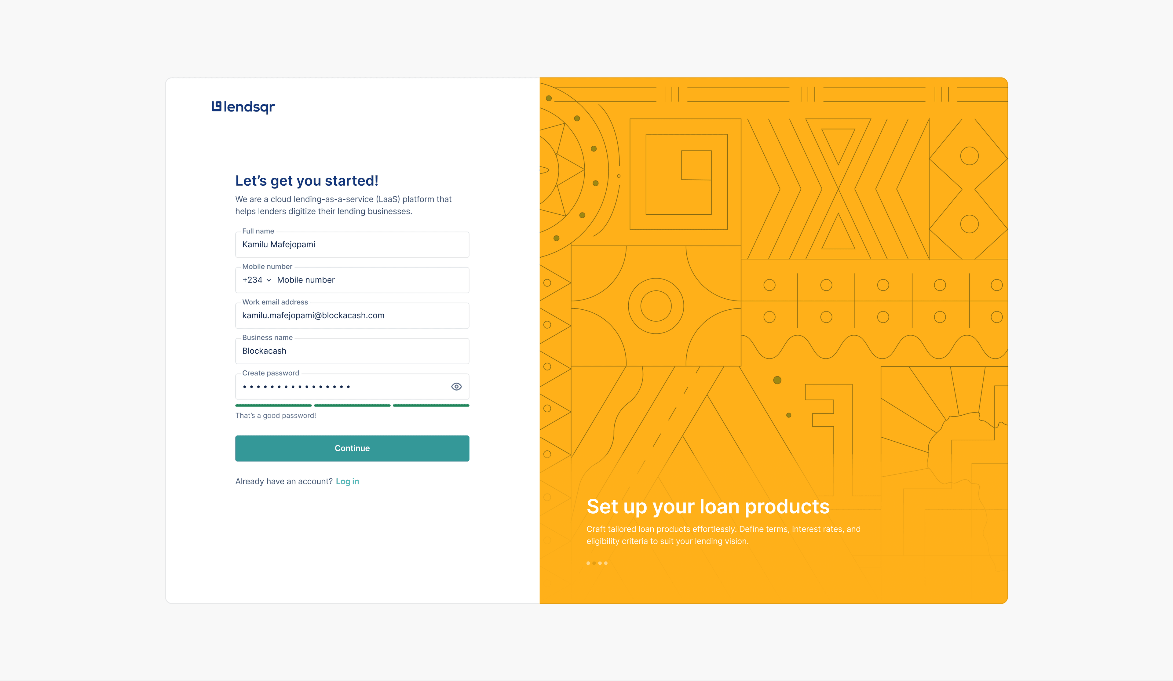
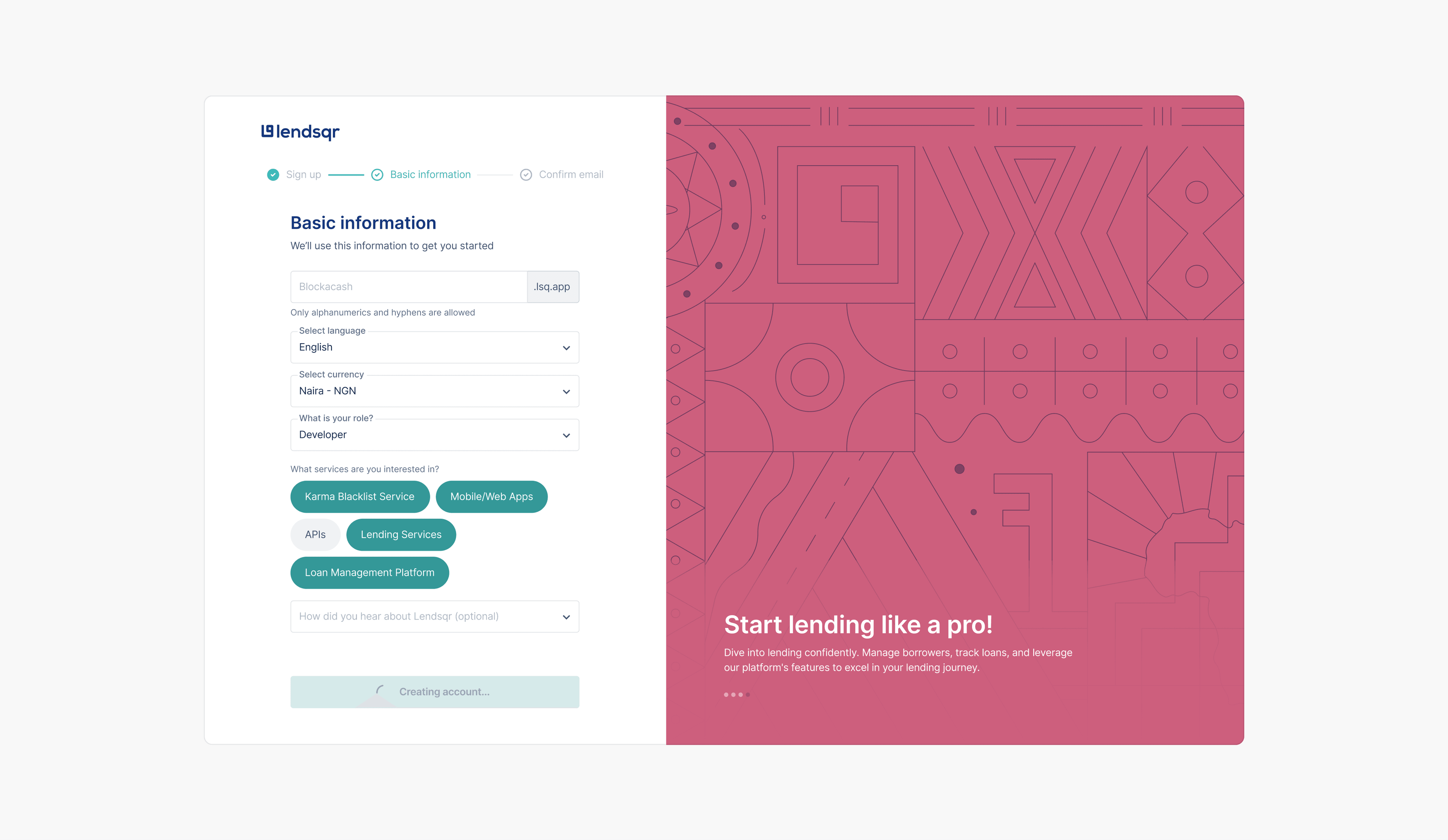
I simplified the onboarding flow by separating what users needed before entering the product from what they could complete later. The original flow had seven setup steps, but not all of them were necessary upfront.
- Old flow. Profile creation → basic information → email verification → business information → address information → documents upload → link a bank account.
- New flow. Profile creation → basic information, improved → email verification.
I kept the essential steps in onboarding and moved the rest into the product, where lenders had more context and could complete setup at the right time. This reduced onboarding from over ten minutes to about three to five, without removing important configuration work.
Turning Getting Started into an action-oriented experience
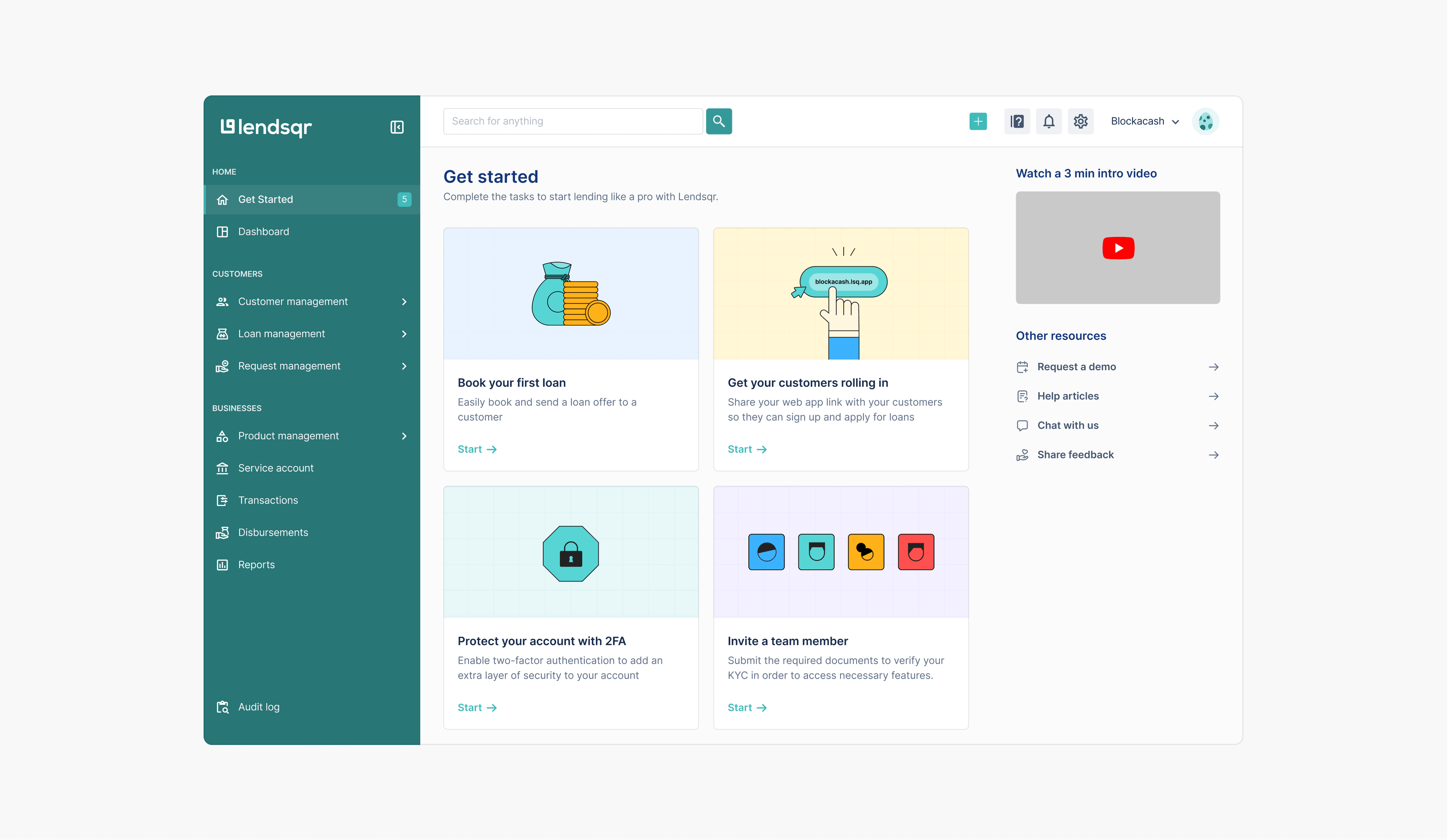
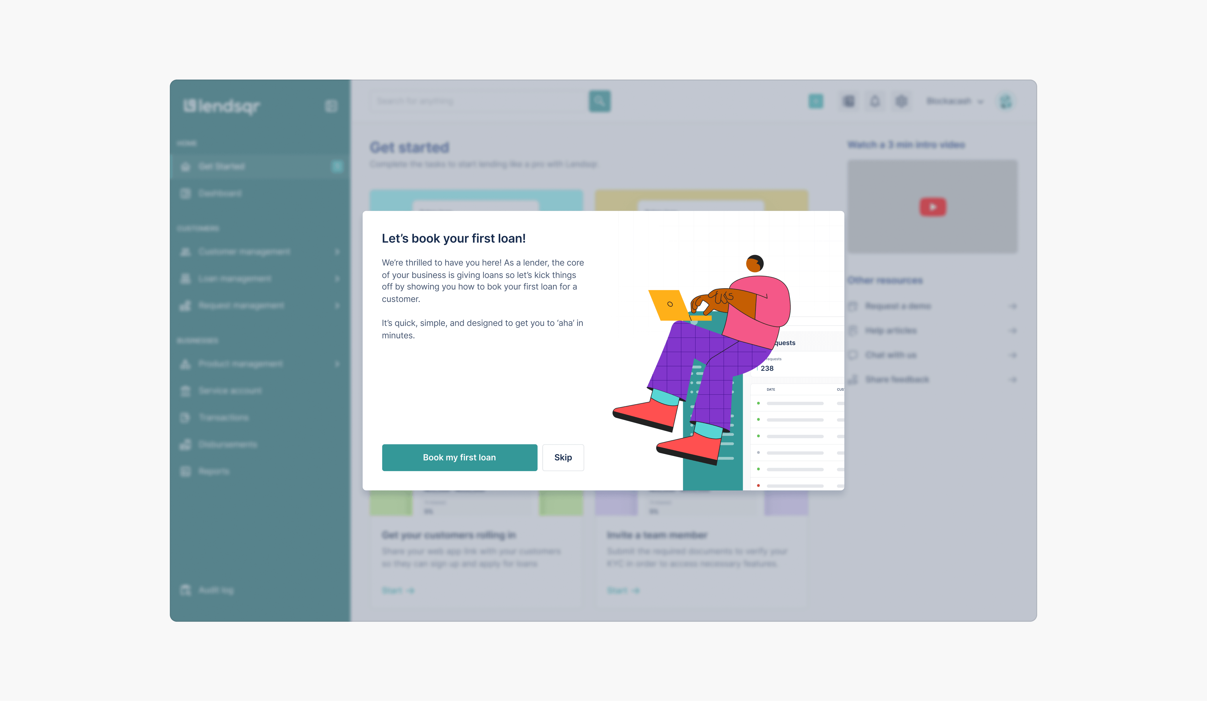
I redesigned the Getting Started experience to help users act, not just read.
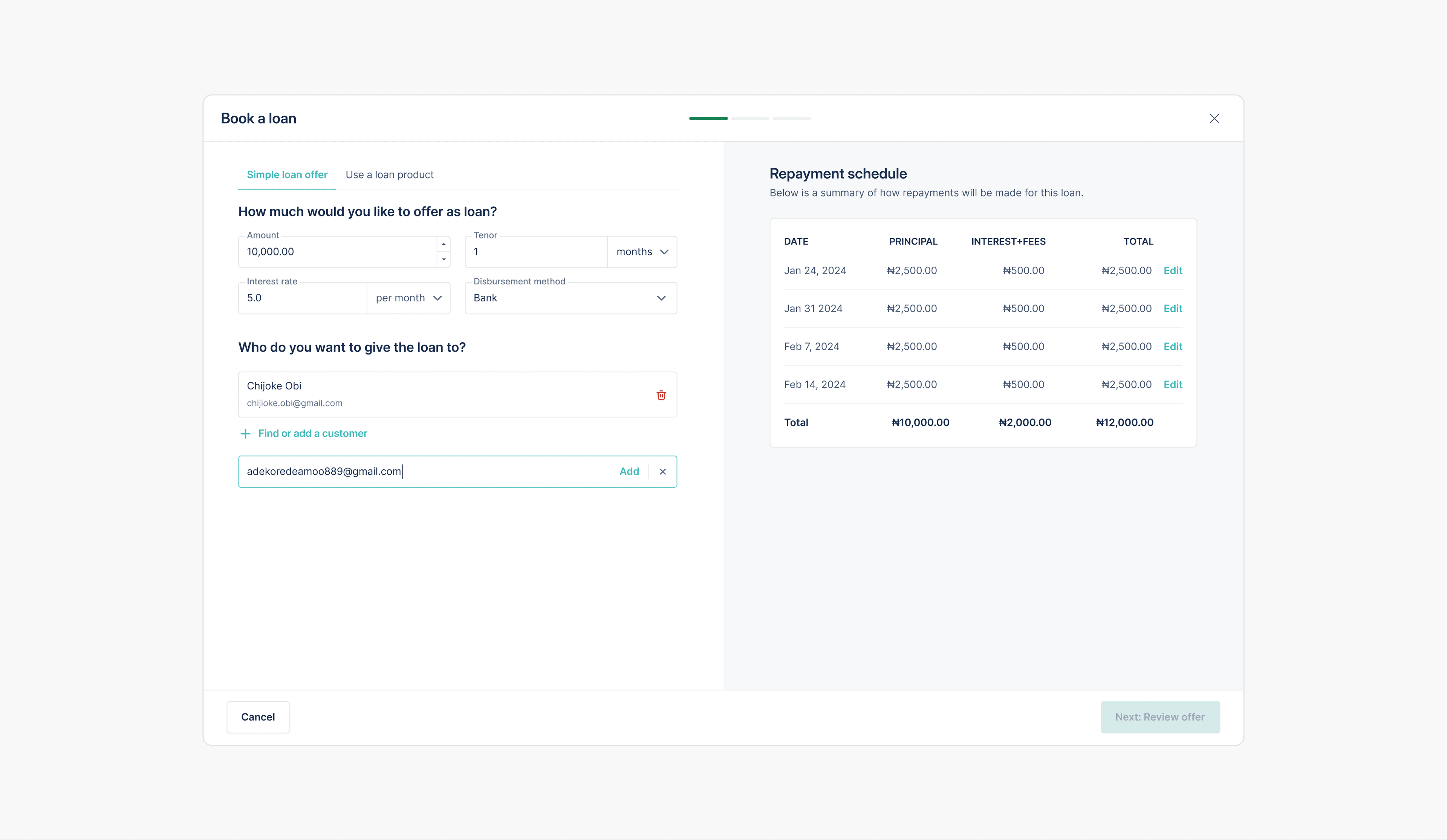
Instead of presenting a list of guides, the new experience focused on clear setup actions. Users could see what they needed to do next: booking their first loan, sharing their customer web app, setting up 2FA, or inviting team members.
This made the experience more practical and helped new lenders move from onboarding into meaningful product use. Guides and resources were still available, but they became supporting material rather than the main onboarding experience.
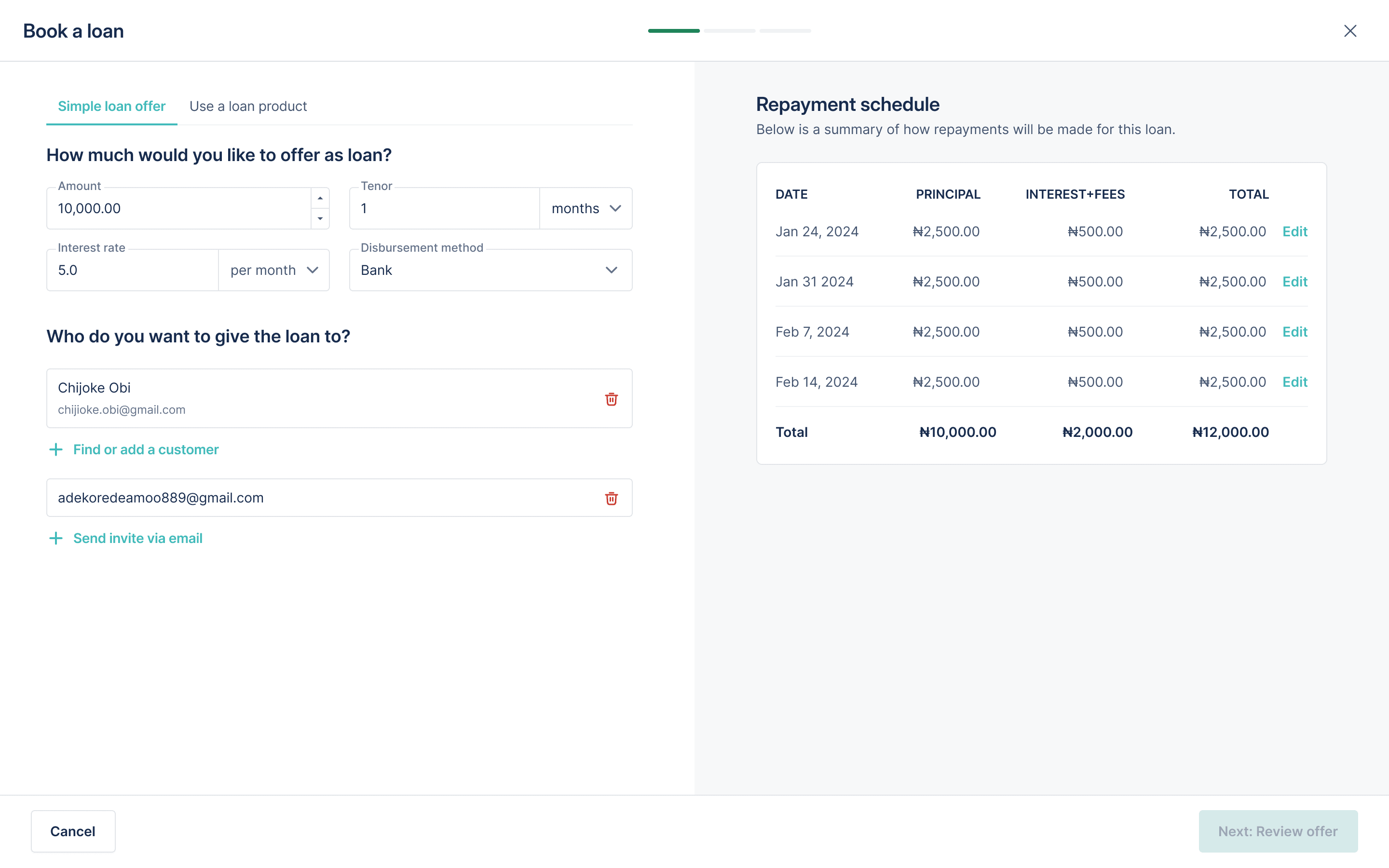
Introducing default loan products to help lenders reach value faster
One of the most important moments for a new lender is understanding how the loan booking experience works. But setting up loan products from scratch could be time-consuming, especially for users who were still exploring the platform. This delayed the moment when users could experience the value Lendsqr had to offer.
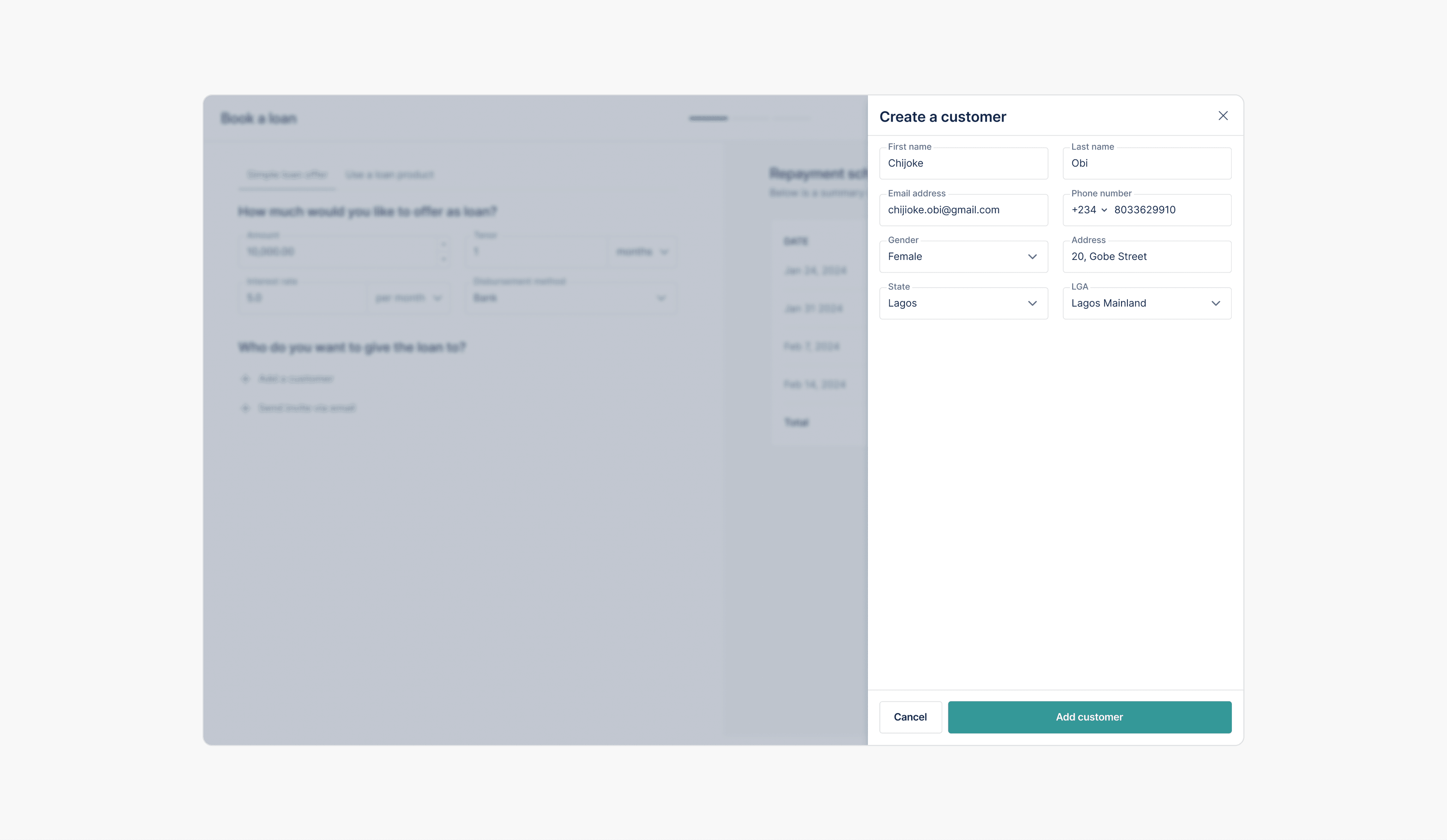
I worked with stakeholders to introduce default loan products for new users. These were pre-configured around common use cases, allowing lenders to test and understand the loan booking experience without first building everything from scratch.
Defaults reduced setup effort and helped users experience value earlier. Instead of starting with a blank configuration process, users had something functional to explore, test, and build on.
Creating a foundation the team could build on: the Pecunia Design System
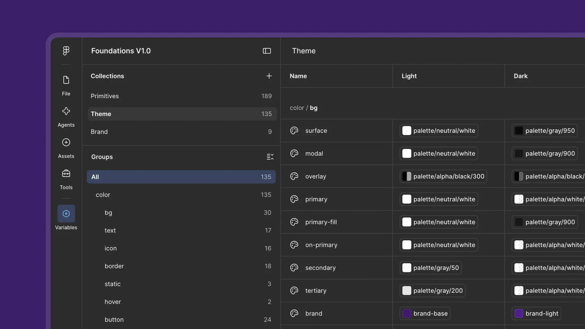
Alongside the onboarding redesign, I created the foundation for Pecunia, Lendsqr’s back-office design system.
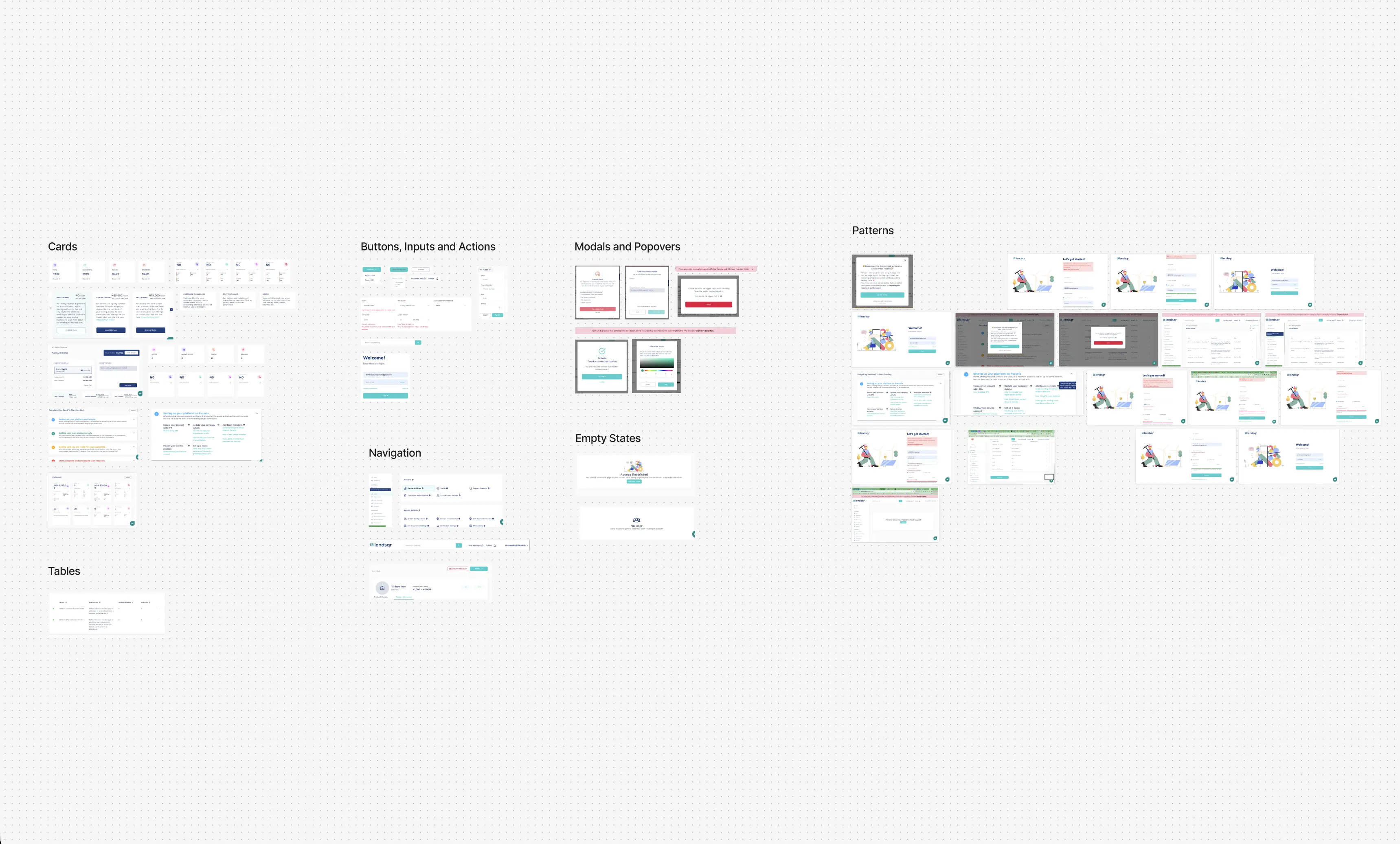
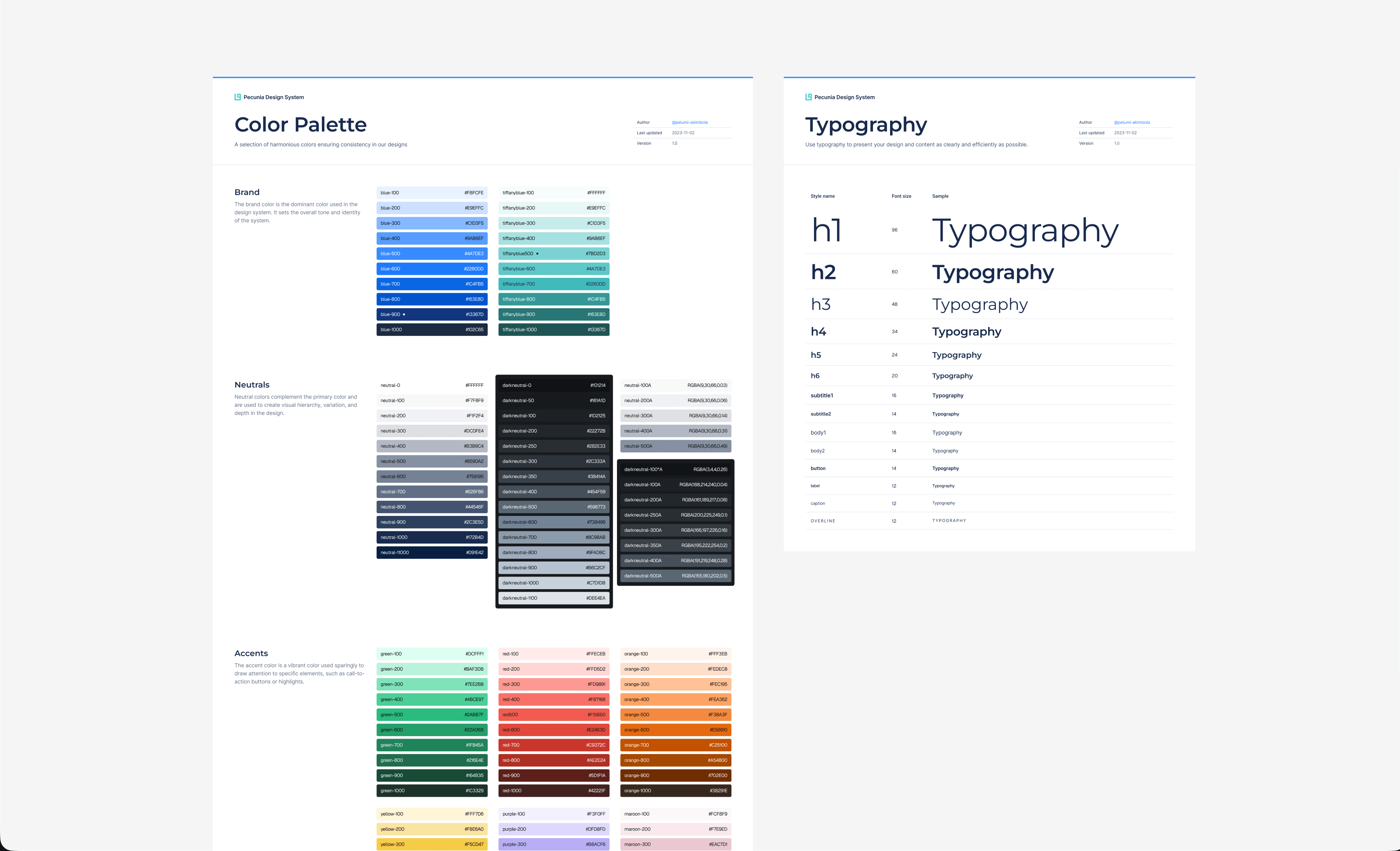
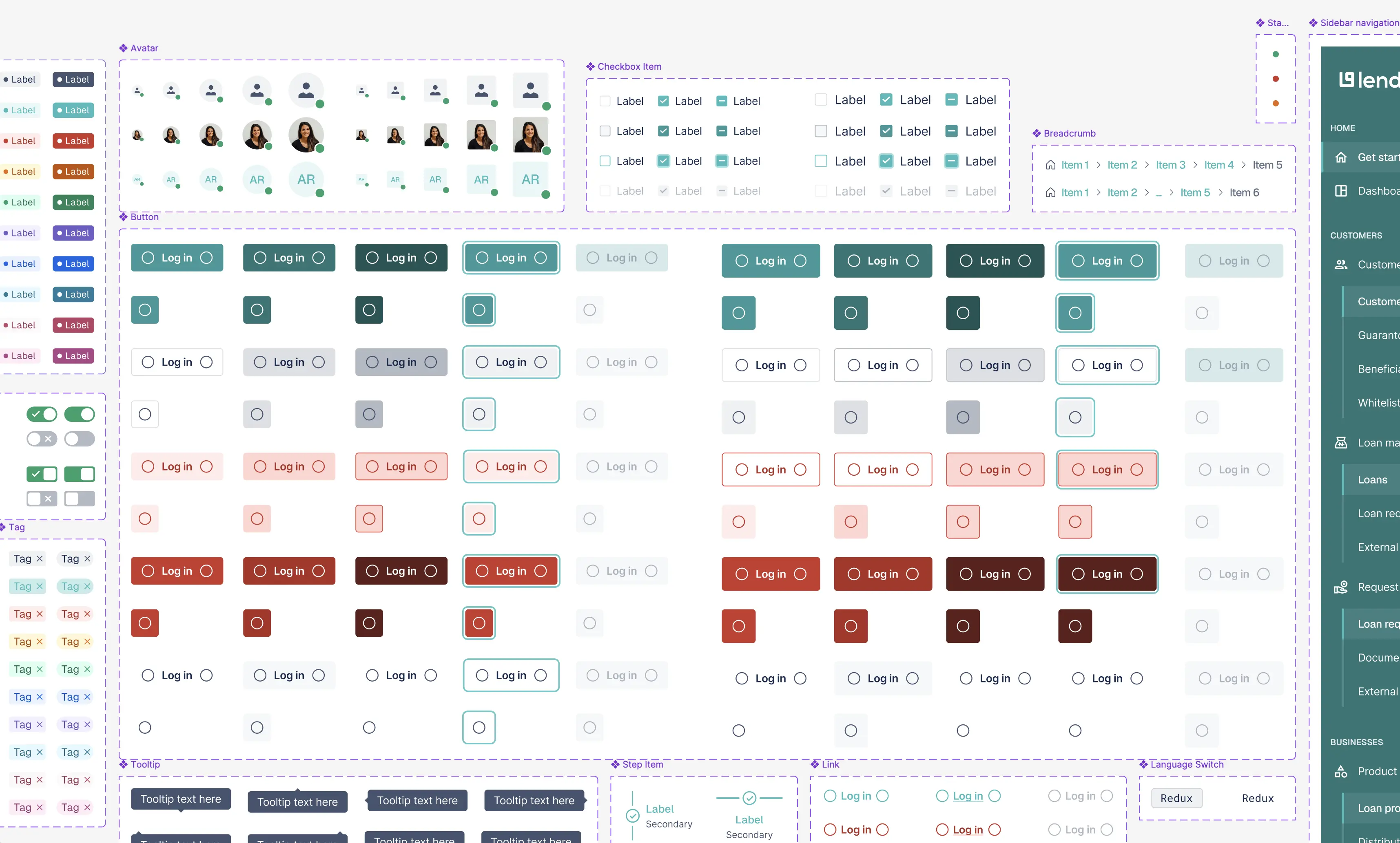
I audited the existing interface and grouped repeated patterns across cards, buttons, inputs, actions, modals, popovers, navigation, empty states, and tables. That audit became the foundation for the system.
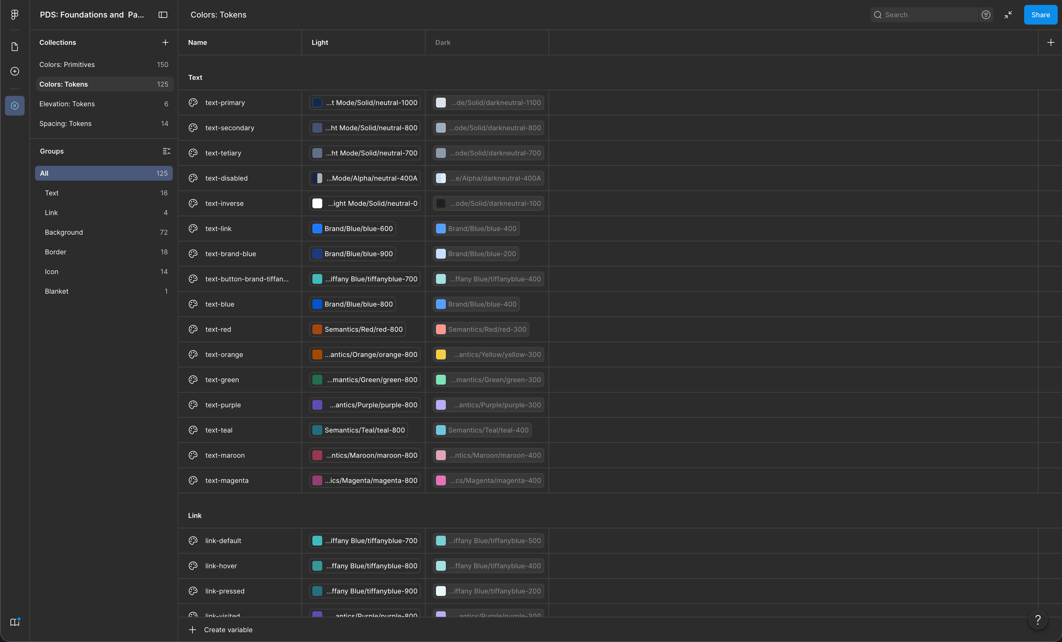
Pecunia standardised core UI elements, typography, colours, and reusable patterns, and incorporated design tokens, so the product could scale with more consistency. It helped engineers refactor faster and apply improvements to parts of the product that were outside the immediate redesign scope — which made the redesign itself more scalable, because the team could keep improving the product with a shared visual and interaction language.
Results
The redesign improved the quality of users entering the product, reduced onboarding friction, and gave the team a stronger foundation to keep improving the back office.
- 60% fewer misaligned sign-ups. The new intent-selection screen helped borrowers take the right path before entering the lender back office.
- Onboarding in three to five minutes, down from over ten. Cutting the upfront flow from seven steps to three let lenders reach the product faster and complete the rest of their setup later, in context.
- Less post-onboarding confusion. The redesigned Getting Started experience gave users clearer next steps after account setup, and fewer of them needed help working out where to go.
- Faster product refactoring. Pecunia gave engineers reusable patterns they could apply well beyond the screens redesigned within the initial timeline.
What shipped
The first release covered the full onboarding journey, from a user entering the product to completing lender account setup. The Pecunia Design System was introduced alongside it so the team could implement the redesign consistently and extend improvements across the product.
Further UX improvements to the rest of the application continued later, as the product evolved.
“Onboarding is not just about reducing steps. It is about helping the right users reach the right value at the right time.”
What this project taught me
The biggest shift was moving from a setup-heavy experience to one that helped lenders enter the product faster, understand what to do next, and continue configuring their workspace with more context.
It also reinforced the value of design systems in product work. Pecunia did not just improve UI consistency; it helped the team move faster, refactor more confidently, and extend improvements beyond the original redesign scope.