Redesigning Lendsqr’s back office to improve user experience and operational efficiency
As Lendsqr grew, the back office became a key touchpoint for lenders adopting the platform. But people needed too much hand-holding, and we were seeing too many wrong sign-ups. I redesigned the experience to make setup clearer, guide the right audience, and support lenders better through their first steps. After launch, onboarding time improved to 3 to 5 minutes from over 10 mins, borrower-type sign-ups dropped by 60%, and onboarding friction reduced meaningfully.
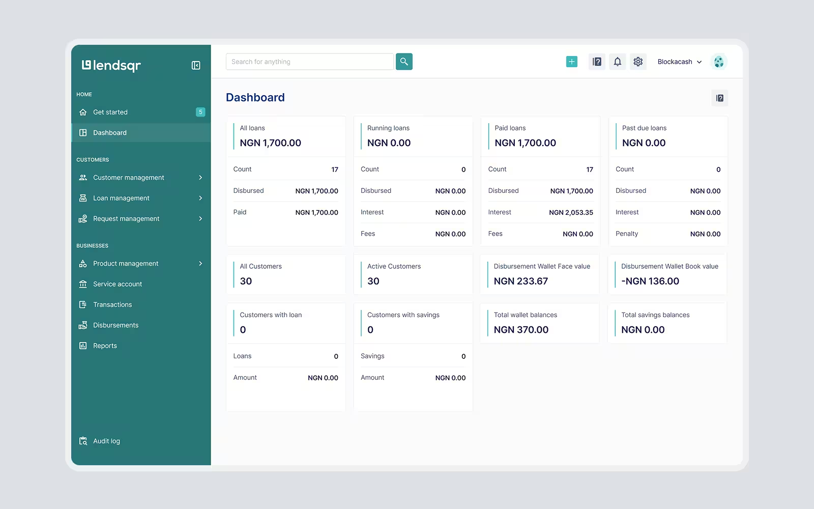
Background
Throughout its years of operation, Lendsqr has consistently enhanced its capabilities and broadened its offerings to meet the evolving needs of its customers. However, this expansion had not come without its challenges. As the company introduced more features and functionalities, the process and user flows inevitably became more complex. Unfortunately, this increase in complexity, while reflective of the company's growth and innovation, led to a less optimal user experience as navigation and usage of the platform had become more difficult for users.
The problem
Before I joined the project, an external team, Assurdly, was brought in to audit the existing user experience and provide feedback. Their initial observations included:
- Overwhelming number of complaints on “simple” issues.
- Lenders struggled to navigate the platform effectively after sign up.
- High onboarding churn due to a lengthy sign up process.
.webp)
My primary task was redesigning the UI for the platform because the current design was outdated and no longer met the needs of their user base but building on Assurdly's findings, my personal audit uncovered additional concerns:
- Misaligned Sign-Ups: About 80% of sign up traffic were from borrowers, rather than lenders (the intended target audience), who were mistakenly signing up on the back-office platform. Existing measures, such as a red-text disclaimer stating “We do not give out loans,” were not effective and created a negative impression. Borrowers were supposed to be redirected to the lender directory, but the sign-up flow did not clearly guide them there.
- Complex User Experience: The app's complexity caused users to get lost among the many features, resulting in a high churn rate after sign-up as users struggled to fully set up their accounts.
- Inconsistent Design Around Features: New features lacked adherence to design guidelines, leading to a disjointed experience across the platform.
My role
I initially started working on this project as a contractor but was eventually hired full-time as the company's Product Designer.
As Product Designer, I led the end-to-end design process, from research and problem definition to visual and interface design, prototyping, and design QA; ensuring the final experience was user-centered, scalable, and aligned with key business goals around growth, efficiency, and retention.
I worked closely with front-end developers, product owners, the CEO and an external QA team, Assurdly.
Goals
The redesign was guided by the following objectives to address the pain points identified during the audit and improve the overall user experience:
- Make onboarding easier and faster by deferring non-critical tasks
- Implement measures to segment and guide users based on their intentions (lender or borrower) early in the sign-up process
- Reduce customer support overload by addressing simple user issues directly on the platform by through improved clarity and guidance
- Modernize the design for a more intuitive experience
- Improve navigation experience so users can find key features easily
- Establish a comprehensive design system to unify UI elements, typography, color, and patterns, ensuring consistency throughout the platform and for new features.
The process
Weeding out the noise
One of the critical issues identified was the high rate of borrower sign-ups on the back office, which was designed specifically for lenders. Borrowers, who are not the primary target audience, often completed the sign-up process, creating noise and misaligned traffic. Efforts were made to redirect this traffic to a lenders directory like adding a disclaimer at sign up stating, “We do not give out loans”, but data showed that the approach had been mostly ineffective.
.webp)
To resolve this, I redesigned the onboarding flow to capture user intent early in the process. A new preliminary screen that forked users journey was introduced, asking users whether they were lenders or borrowers. Based on their selection:
- Lenders were directed to the main sign-up flow for the back office.
- Borrowers were redirected to the lender directory, which listed loan offers from various lenders that leverage Lendqr’s infrastructure for lending.
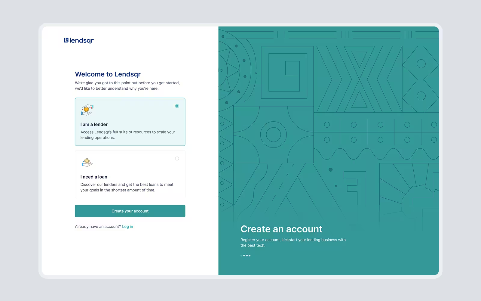
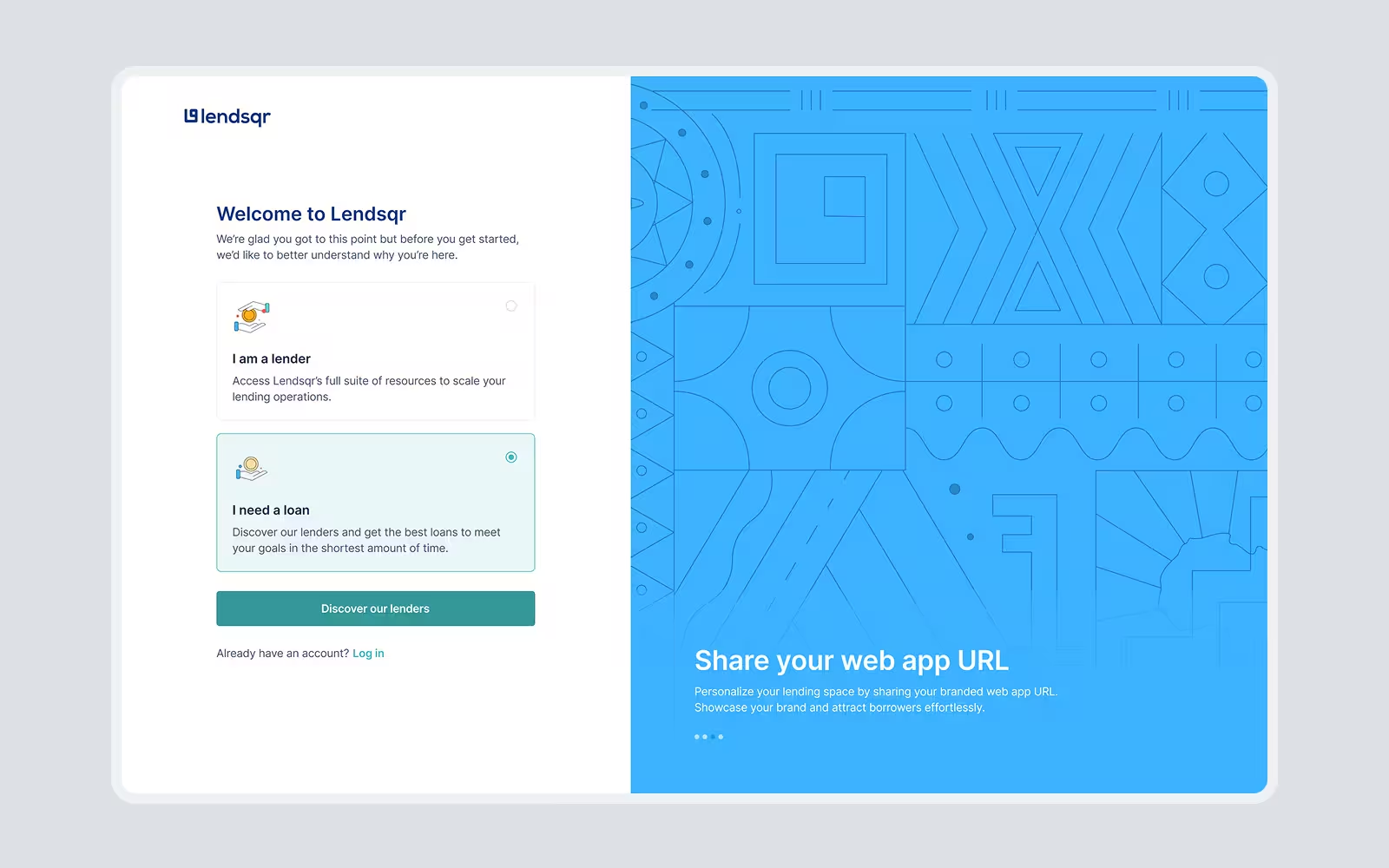
This change reduced borrower sign-ups, allowing the platform to focus its resources on its intended users. Borrower sign-ups still come in but it is not as bad as it used to be.
Streamlining the onboarding flow
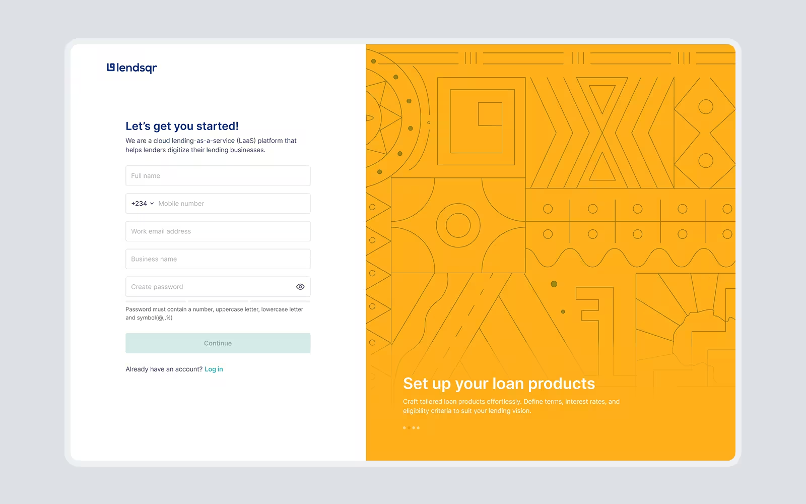
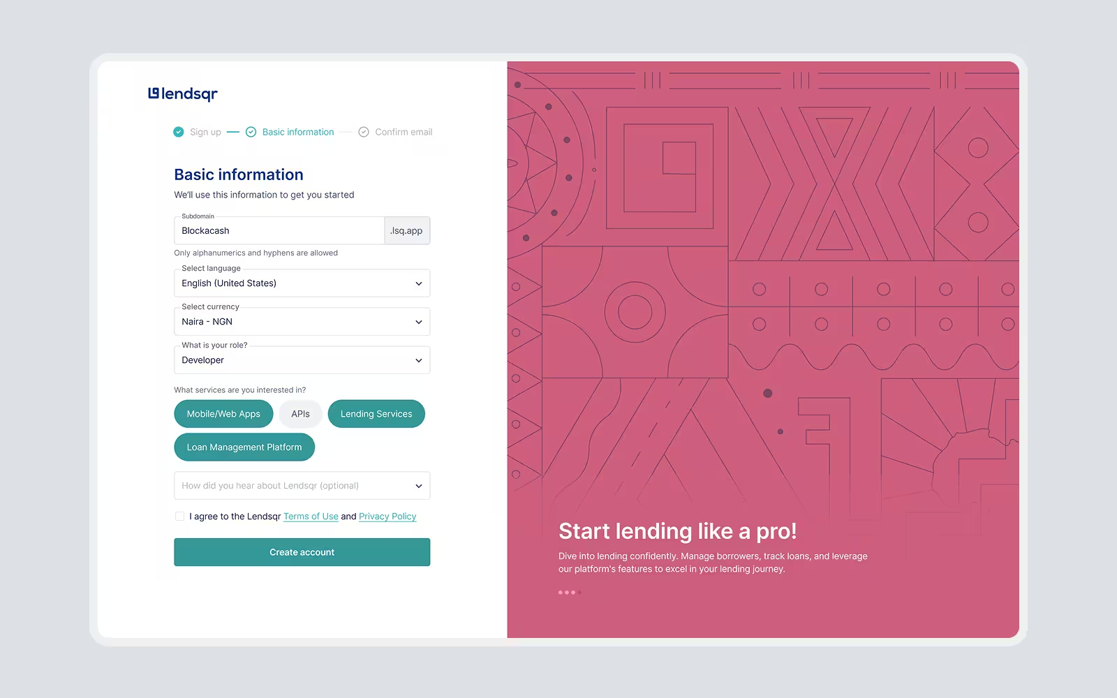
I was able to optimize the onboarding process for lenders by identifying key actions required to set up their accounts. Non-critical steps were moved inside, enabling users onboard faster and access the platform sooner. This flexibility reduced onboarding time to 3-5 mins from ~10mins, allowing users to complete additional steps later at their convenience.
Taking your first steps as a lender
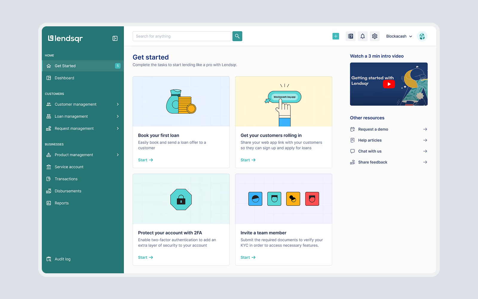
Navigating the admin console as a first-time user was overwhelming due to the poorly structured "Getting Started" page. It provided users with a high-level list of links to guides, leaving them to figure out the next steps themselves. This approach failed to give users clear direction and only added to their confusion.
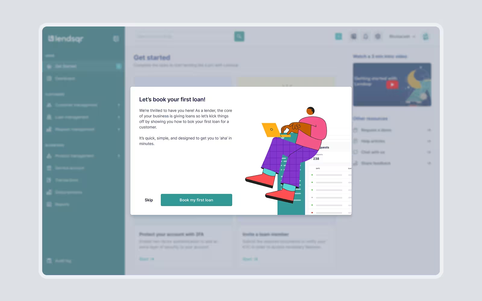
To address this, I redesigned the "Getting Started" page to present information in a more meaningful, actionable, and motivating way. Drawing inspiration from proven designs, I implemented the following solutions:
- Step-by-Step Guidance: I replaced text-heavy content with simple, actionable steps, each accompanied by a call-to-action (CTA) button that took users directly to the relevant action. For instance, if a user needed to set up their first loan product, the CTA would lead them straight to the loan creation page.
- Integrated Guides: While prioritizing action, I ensured that users who needed additional help could access guides as an optional resource, rather than overwhelming them from the start.
Establishing defaults for new users
Beyond redesigning the pages, I addressed a deeper challenge: how to enable users to quickly get up and running with minimal effort. At the time, it took new users so much time to set up their loan products and test them out to understand the value of the solution. My research into SaaS onboarding strategies revealed the importance of creating defaults which are pre-configured settings or features that allow users to see immediate value without extensive setup.
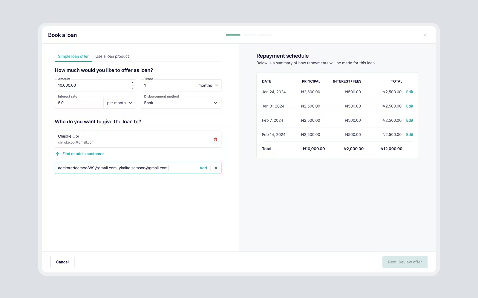
Taking this new knowledge in, I worked closely with the stakeholders and we are able to implement two default loan products for new users:
- These loan products were pre-configured to reflect the most common use cases, ensuring that users could start lending immediately or at least test the experience without needing to build products from scratch.
- By offering pre-created defaults, users could explore the platform's functionality, understand its value, and gain confidence in their ability to operate as digital lenders.
Defaults like these not only make onboarding faster but also ensure that users experience value early.
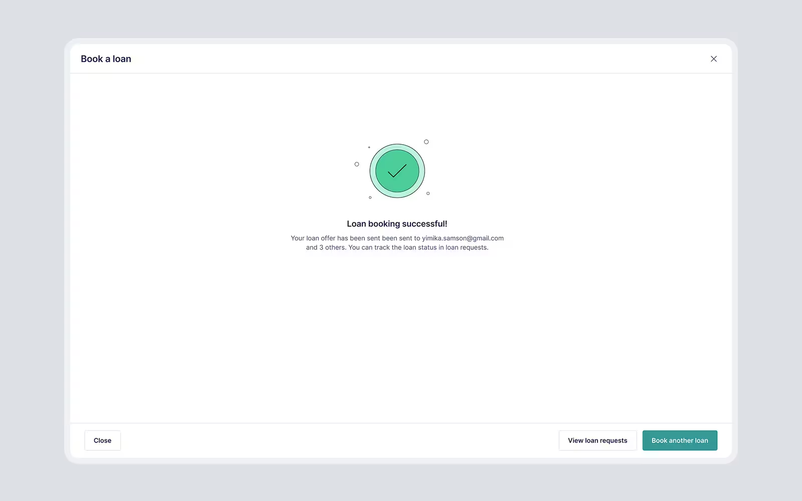
The birth of Pecunia Design System
One of the critical challenges faced by the team was the lack of defined set of patterns and reusable components especially when new features were added, which resulted in several issues impacting user experience, consistency, and efficiency.
To address this, I conducted a thorough audit of the platform, identifying all existing elements and patterns to uncover redundancies and gaps.
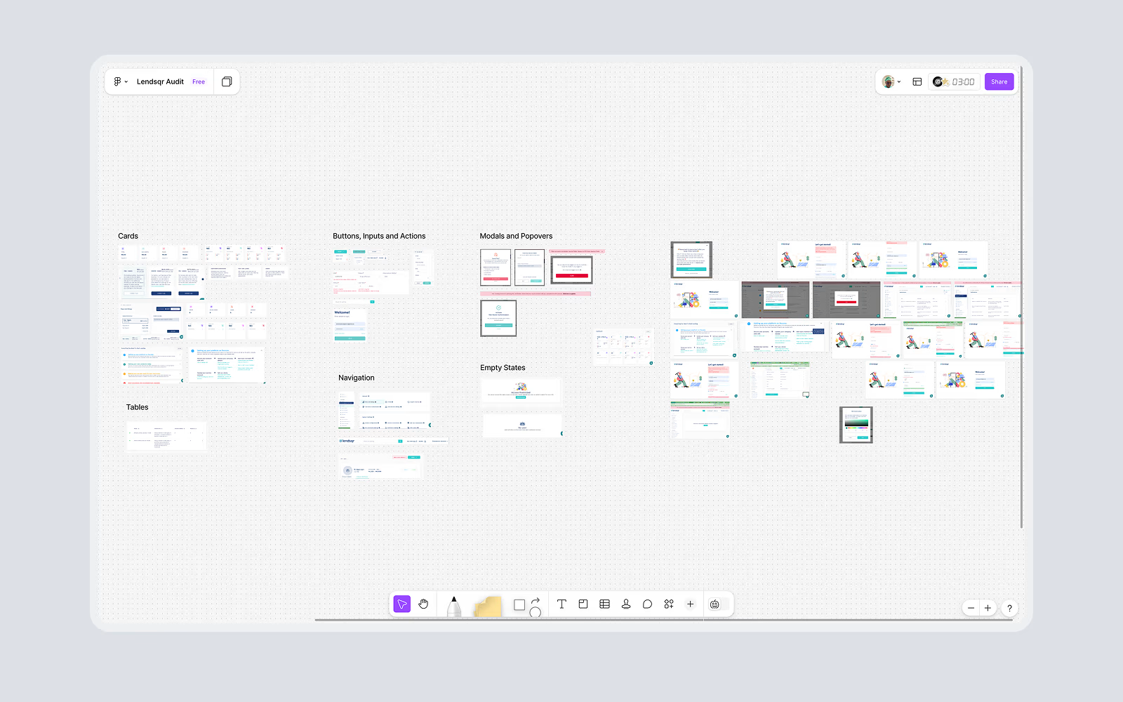
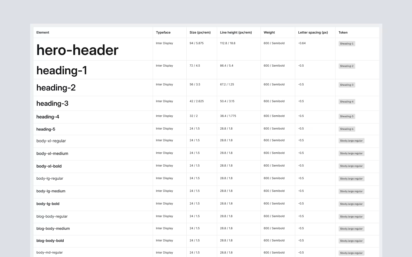
Addressing these challenges resulted in the creation of the Pecunia Design System where I was able to standardize all the components components, typography, color, and UI patterns, ensuring a cohesive look and feel across the platform, and establishing a brand for consistency going forward.

Results
The redesign of Lendsqr’s admin console brought significant improvements to both user experience and business outcomes. By addressing the core pain points through targeted solutions, the project delivered measurable impact:
- The new segmentation screen successfully redirected most borrowers to the lender directory recording ~ 60% reduction in misaligned borrower sign-ups.
- It now took lenders 50% less time to sign up; averaging 3-5mins per user.
- The customer support team confirmed reduced queries around onboarding and navigation freeing up the team to focus on more technical enquiries.
- The design system introduced consistency across components, speeding up the design-development cycle for new features and eliminating inconsistencies across the platform.
Reflections and take-aways
This project was a powerful learning experience for me and here are some of the things I learnt working on the project:
- Design for outcomes, not looks. The real success came from focusing on what we wanted to achieve; helping users take the right actions faster and reducing support requests. It reminded me that great design is about results, not just how things look.
- The value of defaults. Adding pre-configured loan products showed me how much easier it is for users to get started when you give them something to build on. Good defaults save effort and help users see value right away.
- Collaboration is everything. Working closely with the CEO and product owners helped us stay aligned and create solutions that worked for both the business and the users.
- Iteration makes it better. Auditing, testing, and refining along the way helped us uncover real pain points and make meaningful improvements.
